When you purchase a Fitbit, and create an account and sync it, did you know you’re sending Fitbit a bunch of data about your heartbeat, activity level, and more? Fitbit has a page that lets you download your Fitbit data so you can use it yourself in your own applications/charts or website (if you want to do something like that). In this article, I will be showing you how you can use Python to create a chart of your heartbeat.
When you login to your Fitbit account, if you go to your Fitbit settings page, you will see a link where you can request and export your data. This is the current URL to get to the export function. https://www.fitbit.com/settings/data/export
When you download and extract your data, you should navigate to the “user-site-export” folder. You will see a lot of .json files. Some of the data available when you download it from your fitbit is your altitude, calories burned, distance walked/run, heart rate and more. In this case, we’re only interested in the heart rate. What I’m doing is taking all the heart rate files and copying/pasting them into a new folder, and I will work with Python in the parent folder.
For our purposes, I’m creating a folder called “fitbit_python”. You can name it anything you want. My fitbit data is being stored in a sub-folder in this fitbit_python folder, so this is how it looks for me
/fitbit_python
—/data
I’m naming my python file “fitbit.py”. What is the “.py” extension? Python!
First thing we have to work on is importing the packages we need. We will be using the os, time, glob and pyplot, and then we will be listing all the files, and eventually filtering out which month we will want to plot.
Remember, I have copy/pasted all my fitbit heart rate data into the “data” folder. Assuming you have python installed, you can see what it looks like now by running this command from the folder where your fitbit python file is “python fitbit.py”. This is a sample of what the result looks like for me. Your result WILL be different.
I’m going to filter out all the data so it’s only going to plot one month, and it will start creating an array of data for that single month.
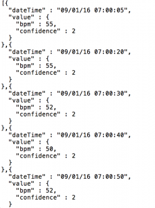
Here’s an example of what the Fitbit data looks like:
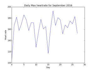
There are many types of charts you could plot. For the purposes of this demonstration, I will plot the maximum heart rate for each day of the month. I’m going to focus on September 2016, so again, my code should look different from yours when you specify what month you want to focus on.
Because we’re parsing JSON data, I have also imported the json package at the top of my file as well.
This is what my current code and result looks like when running the program:
We have all the data we need, now we just need to plot it. I have added the remaining code required to create a plot for the month of September. You can see the updated code here, and you can see the plot result as well.
Click here to view the full code sample.


0 Comments